Cumin Co. 2024
Art Direction, Visual Identity, Brand Identity, Collaterals Design
Industry
Lifestyle & Apparel
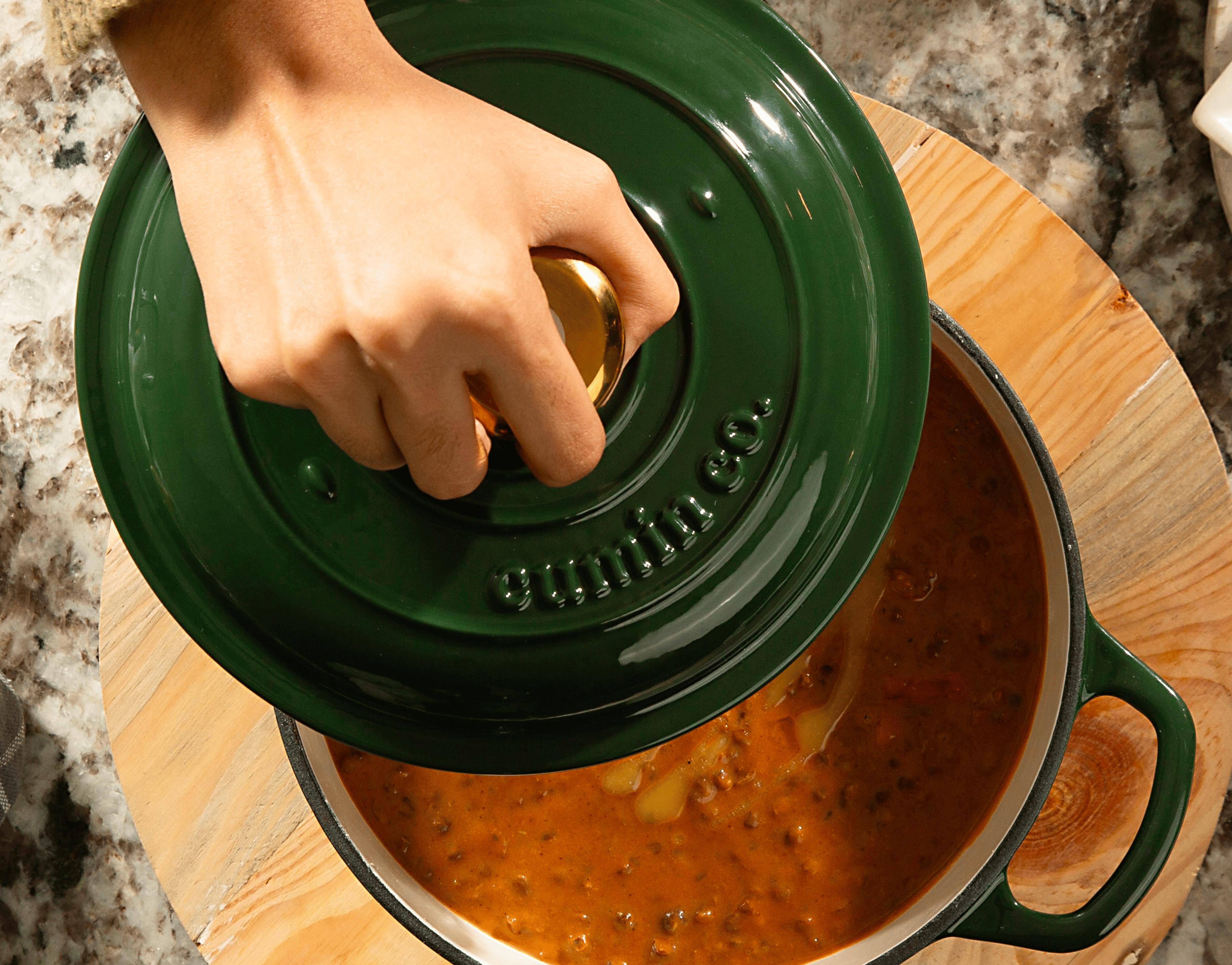
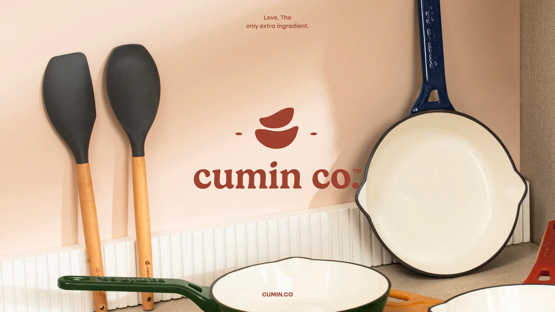
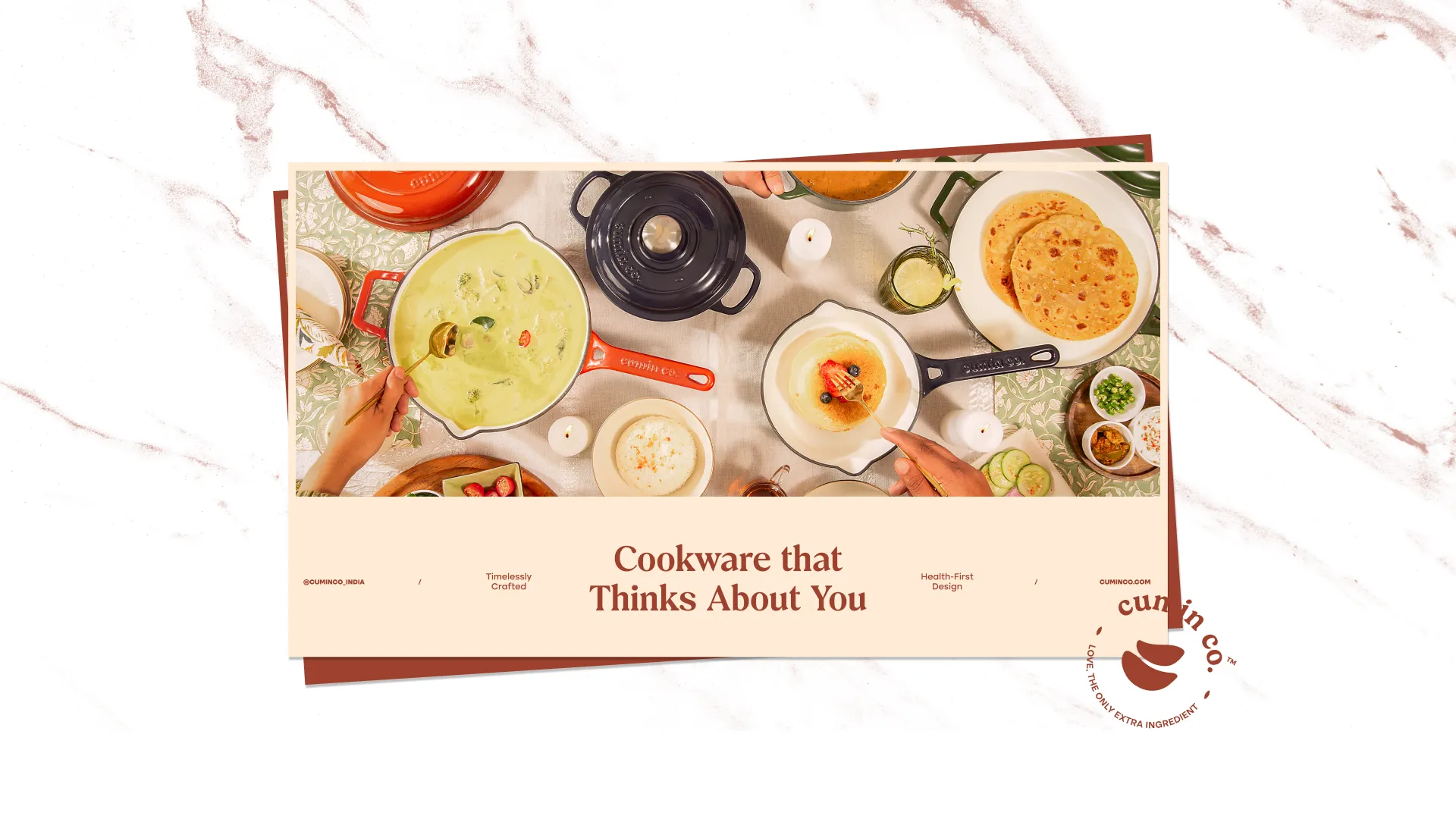
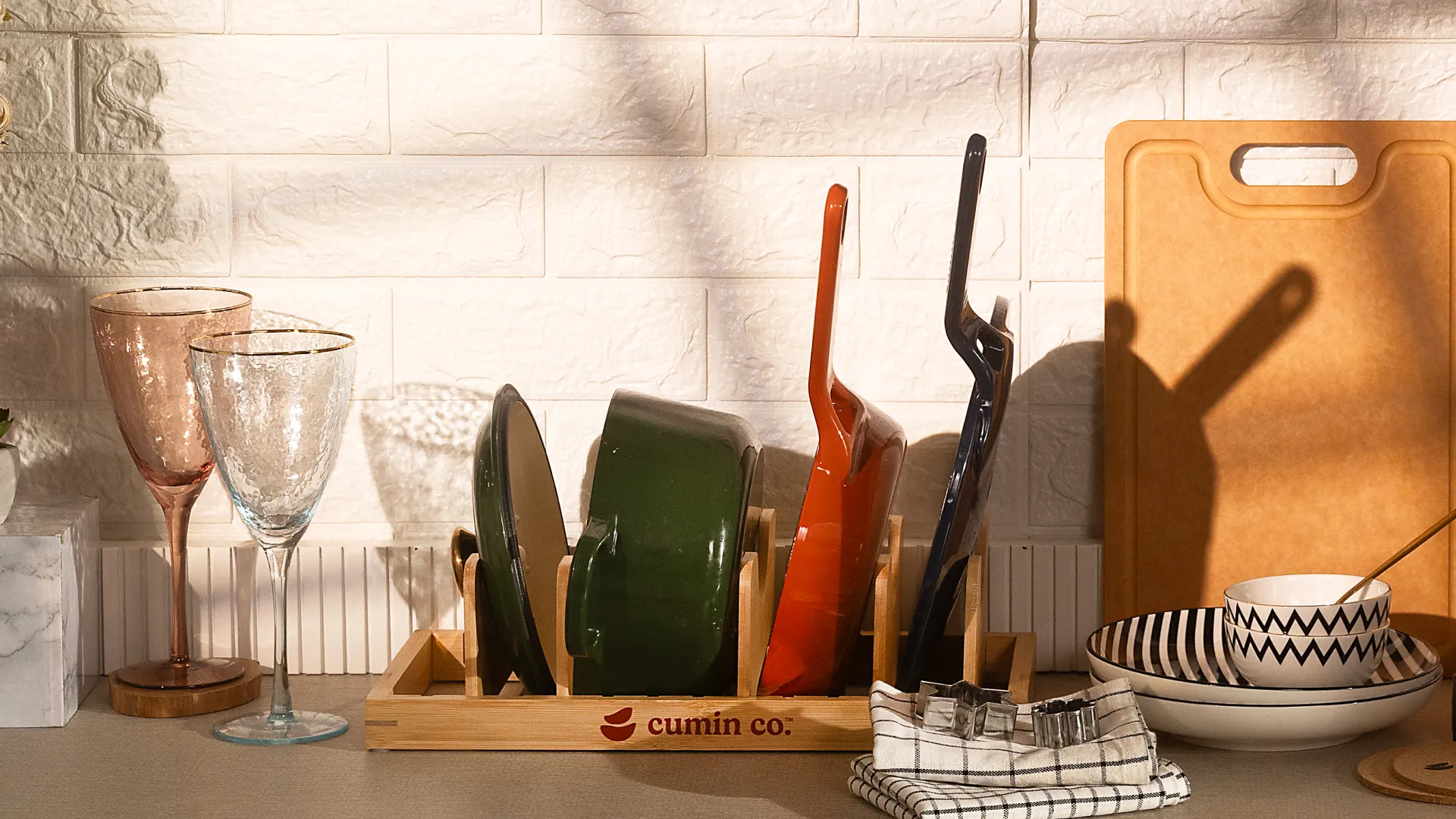
Cumin Co. brings purity, purpose, and warmth back into the Indian kitchen. The brand identity reflects a return to honest materials and mindful design — inspired by the forms and textures of handcrafted pottery. Soft curves, earthy tones, and minimal layouts create a visual language that feels both modern and rooted, echoing the brand’s belief that true wellness begins where every meal does — in the kitchen.
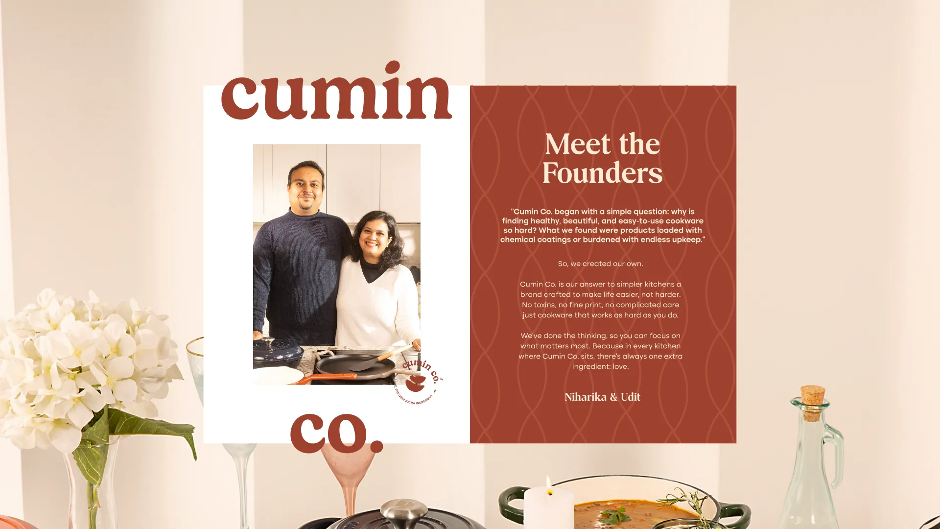
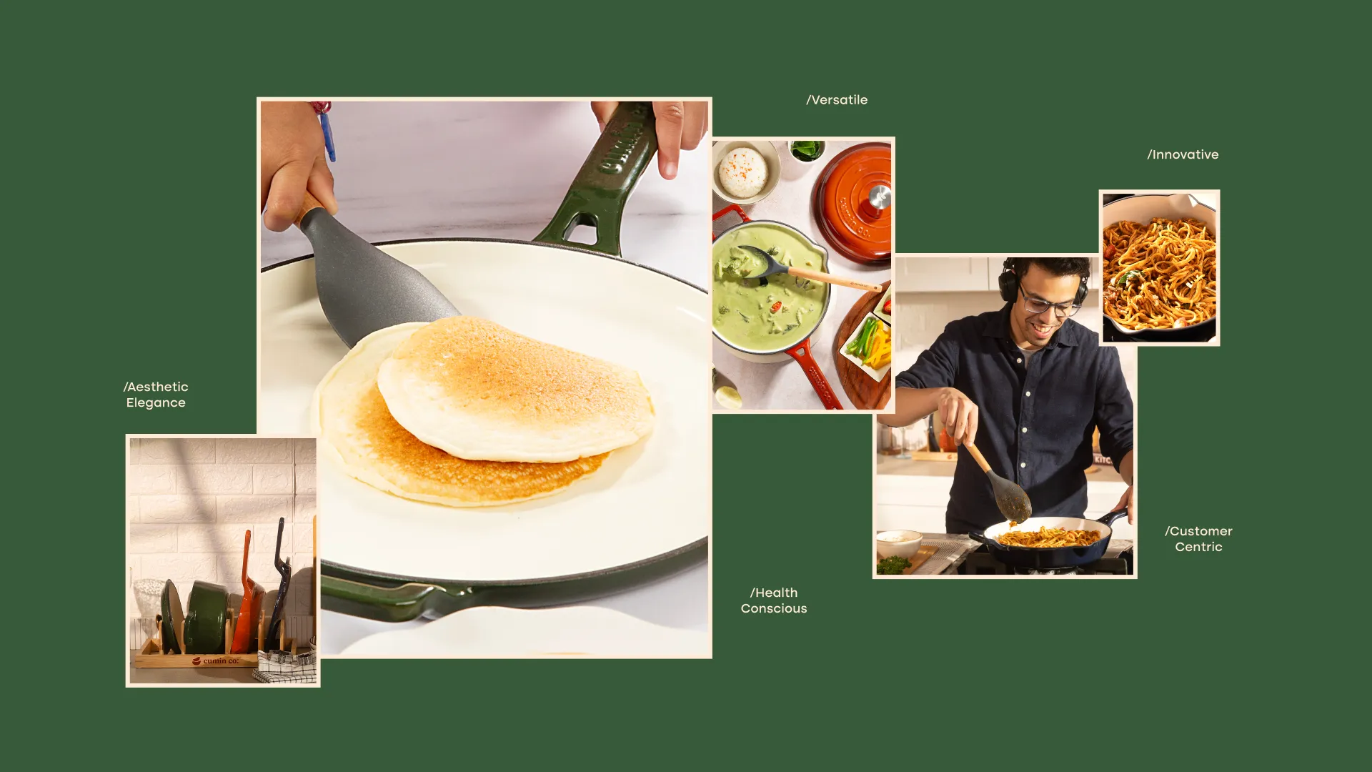
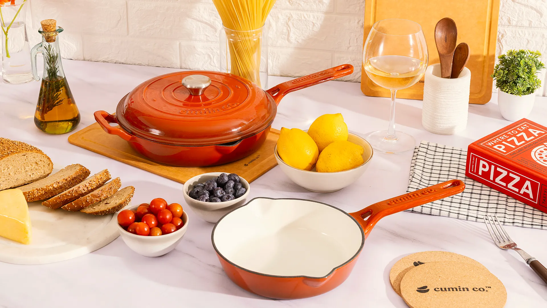
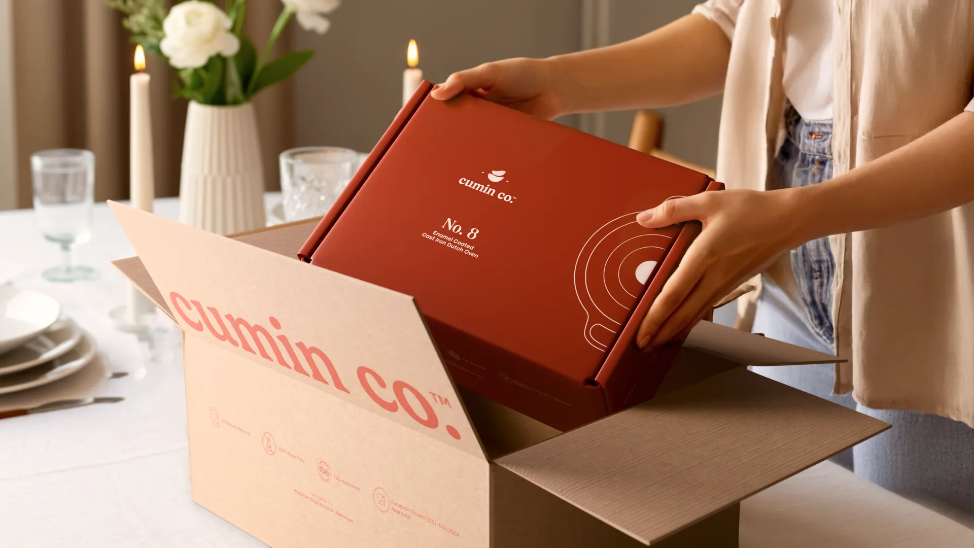
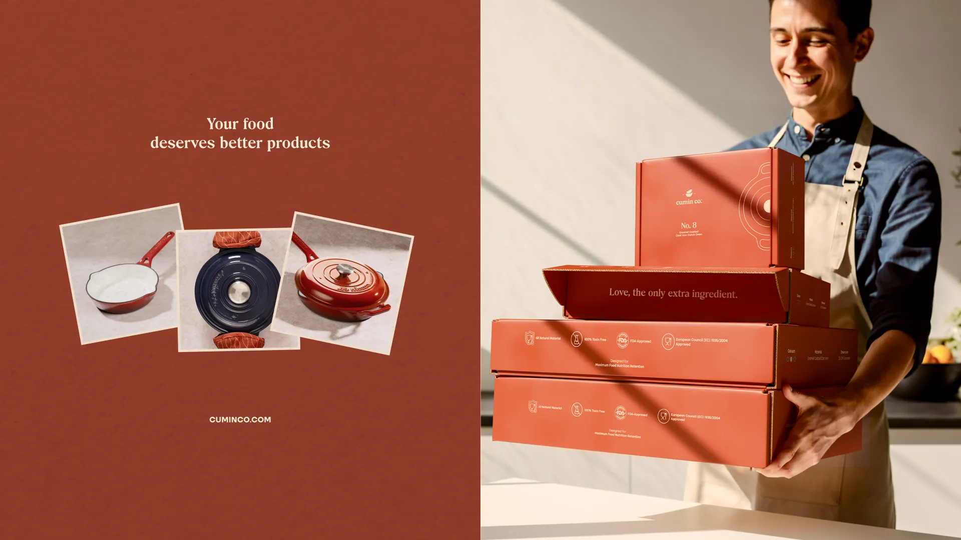
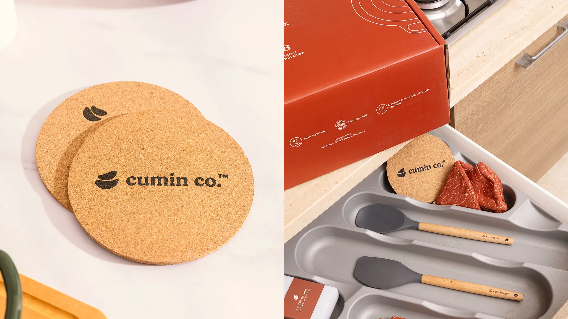
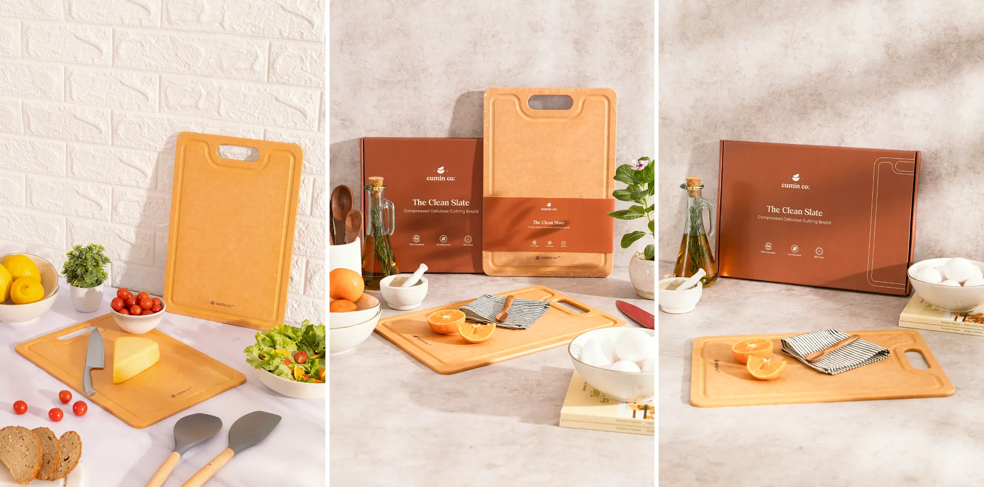
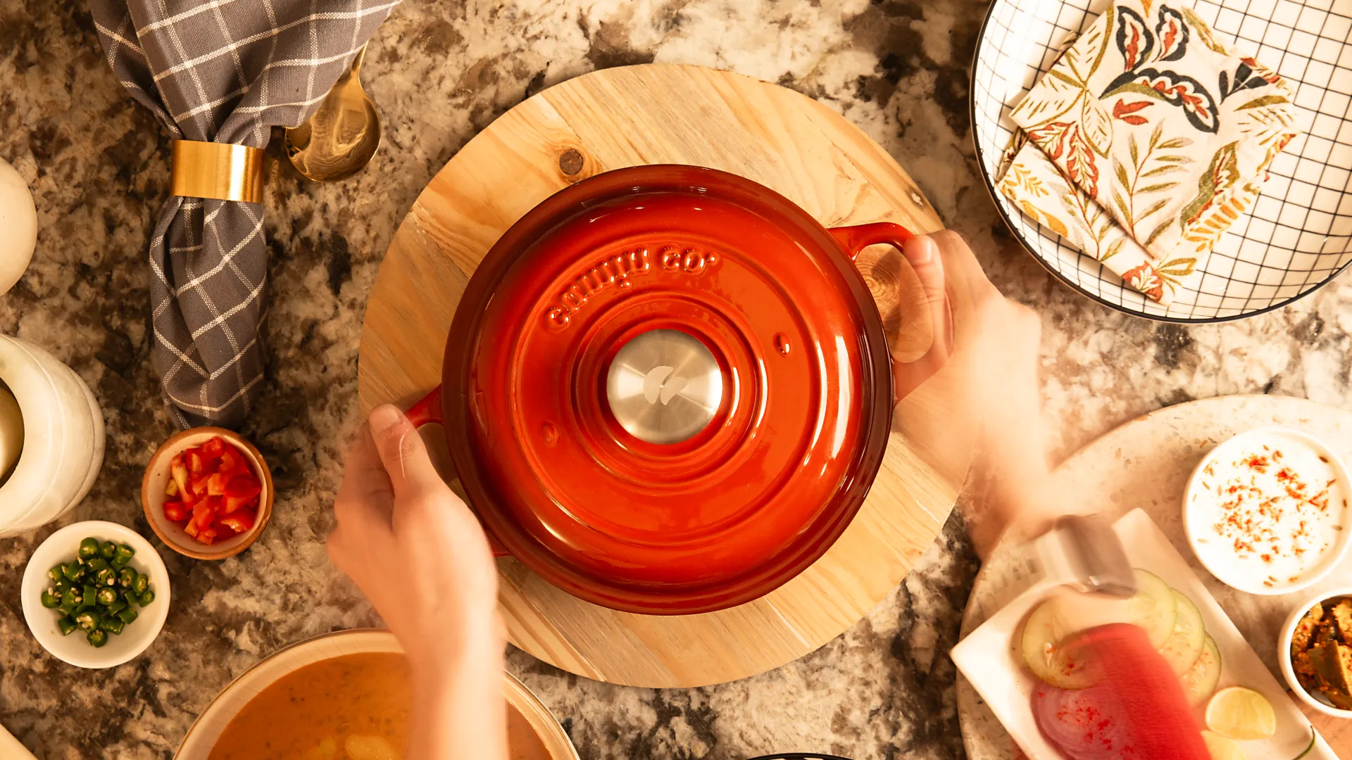
Cumin Co. is a modern cookware brand built on the philosophy of conscious living. Designed for homes that value health and authenticity, their toxin-free cookware is crafted from natural materials. Each piece embodies simplicity, functionality, and care encouraging families to cook and live with intention.
In a market dominated by sleek, synthetic cookware, Cumin Co. wanted to stand for something more grounded, products that feel human, not industrial. The challenge was to communicate trust and purity while maintaining a modern aesthetic that fits today’s kitchens and lifestyles.
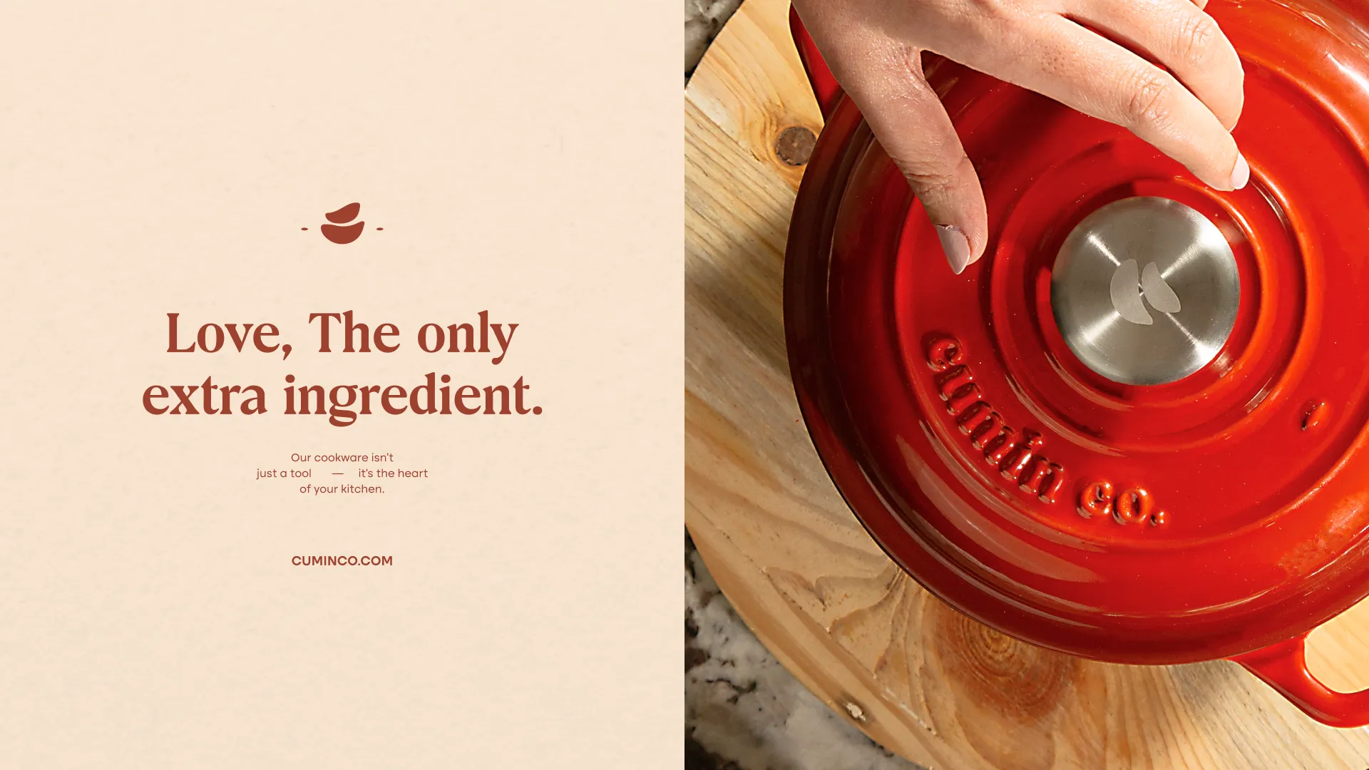
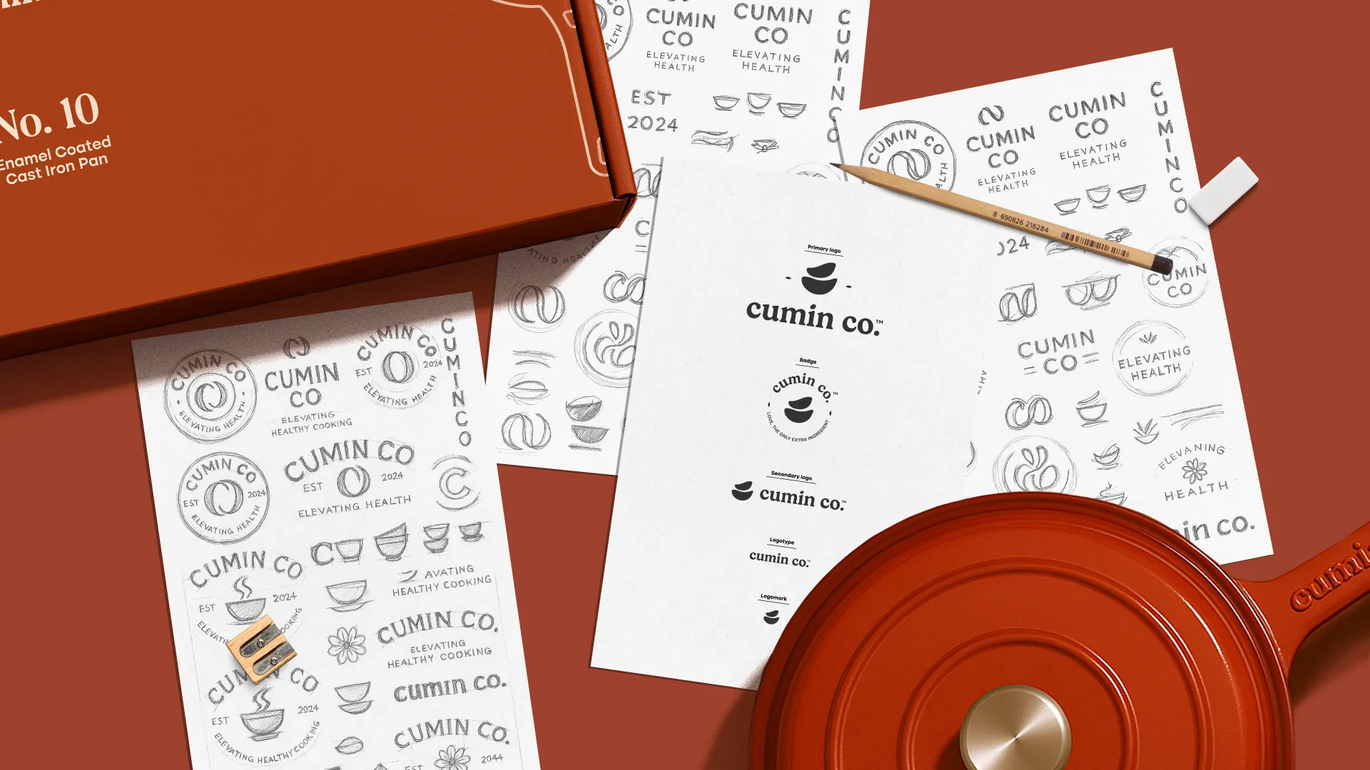
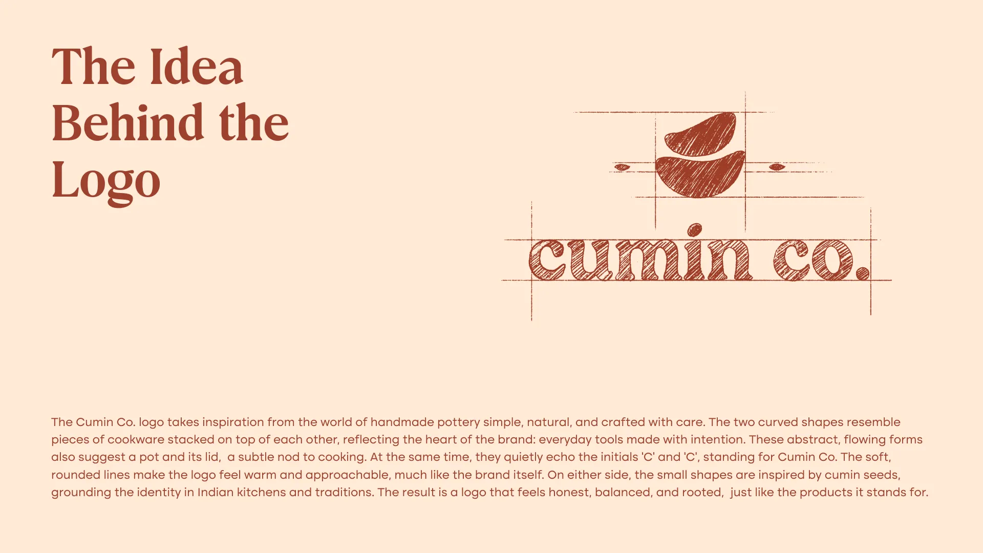
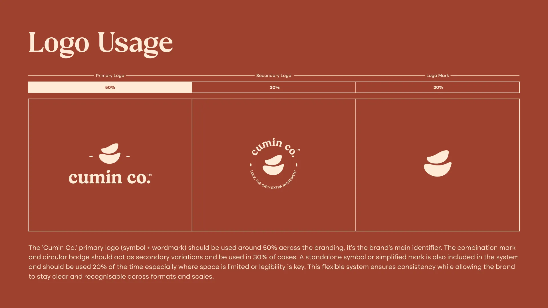
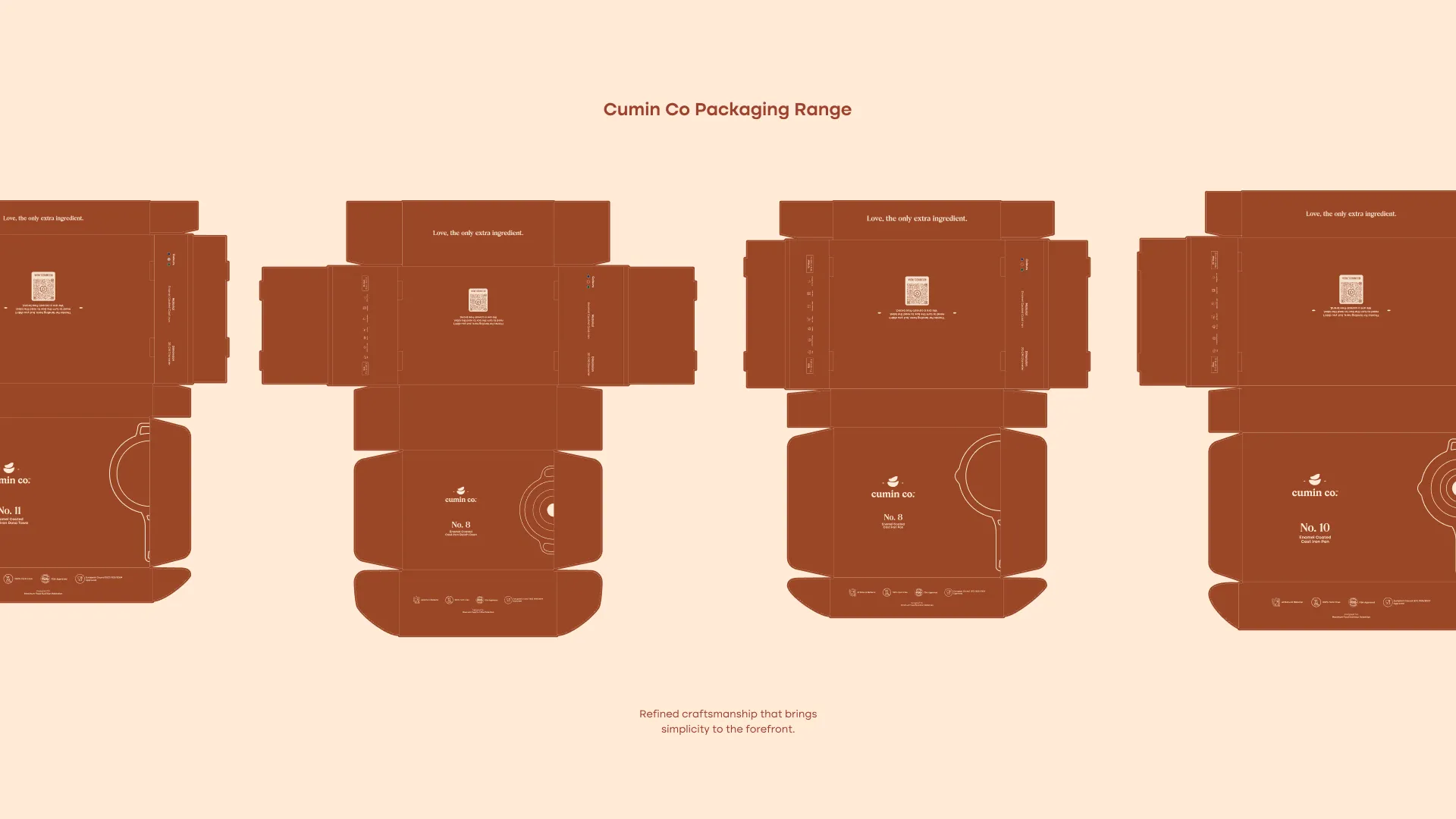
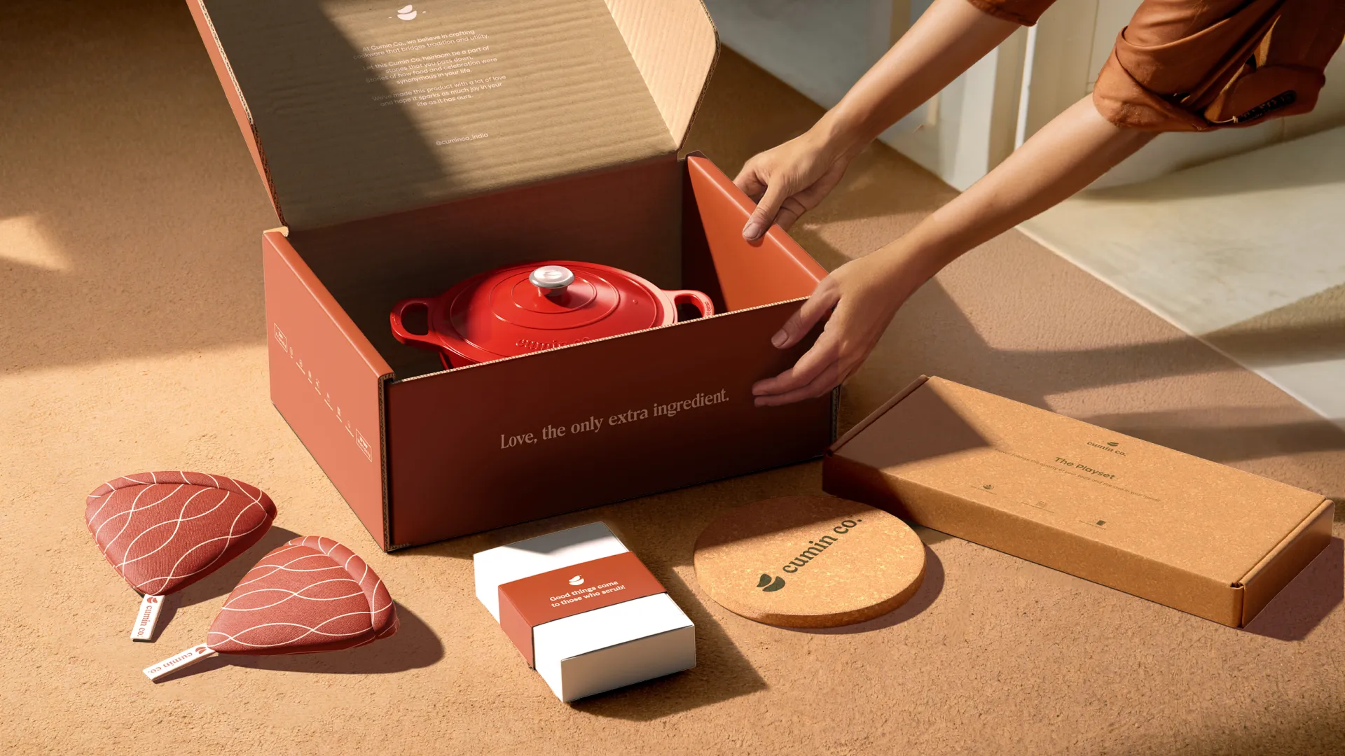
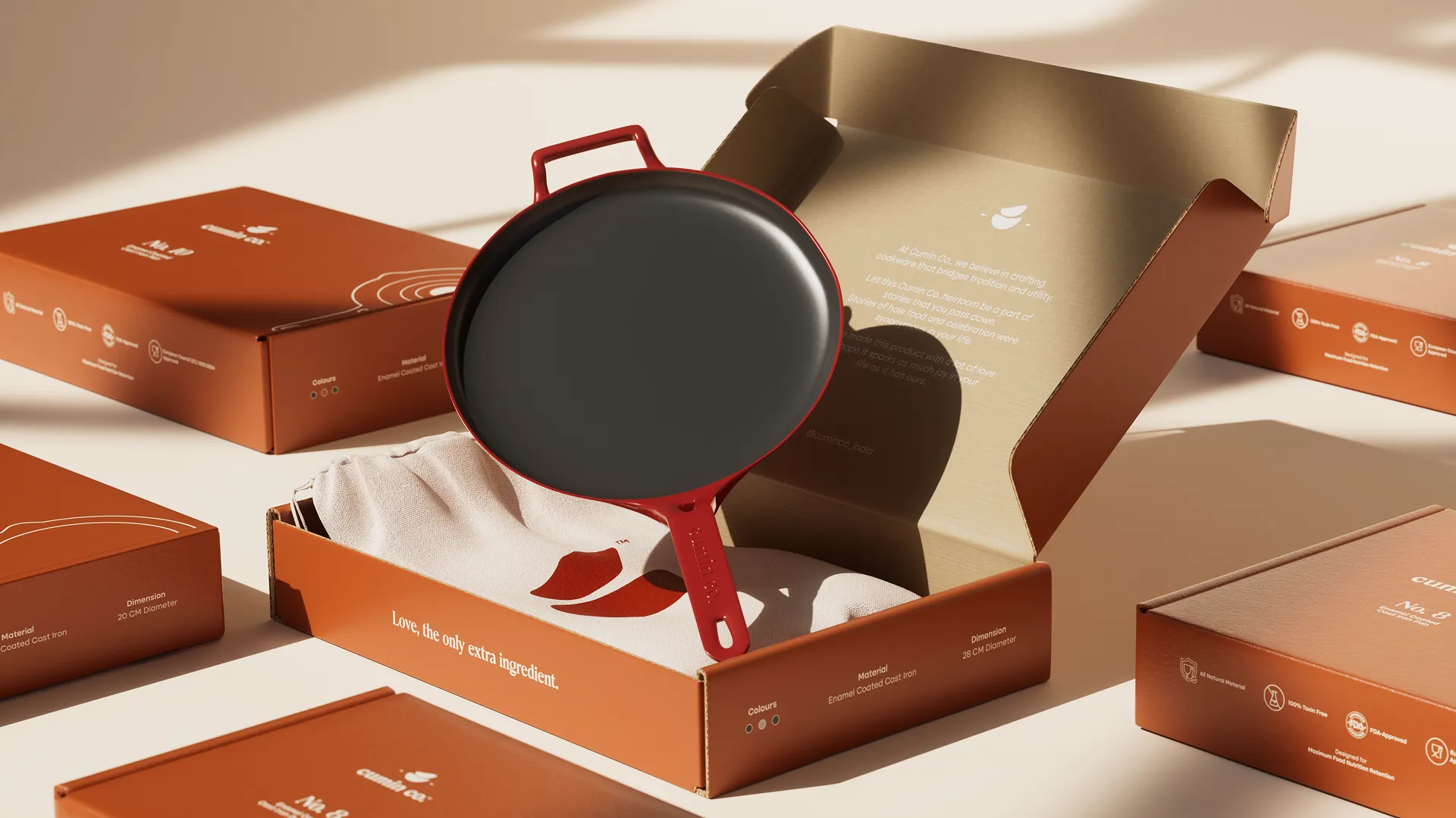
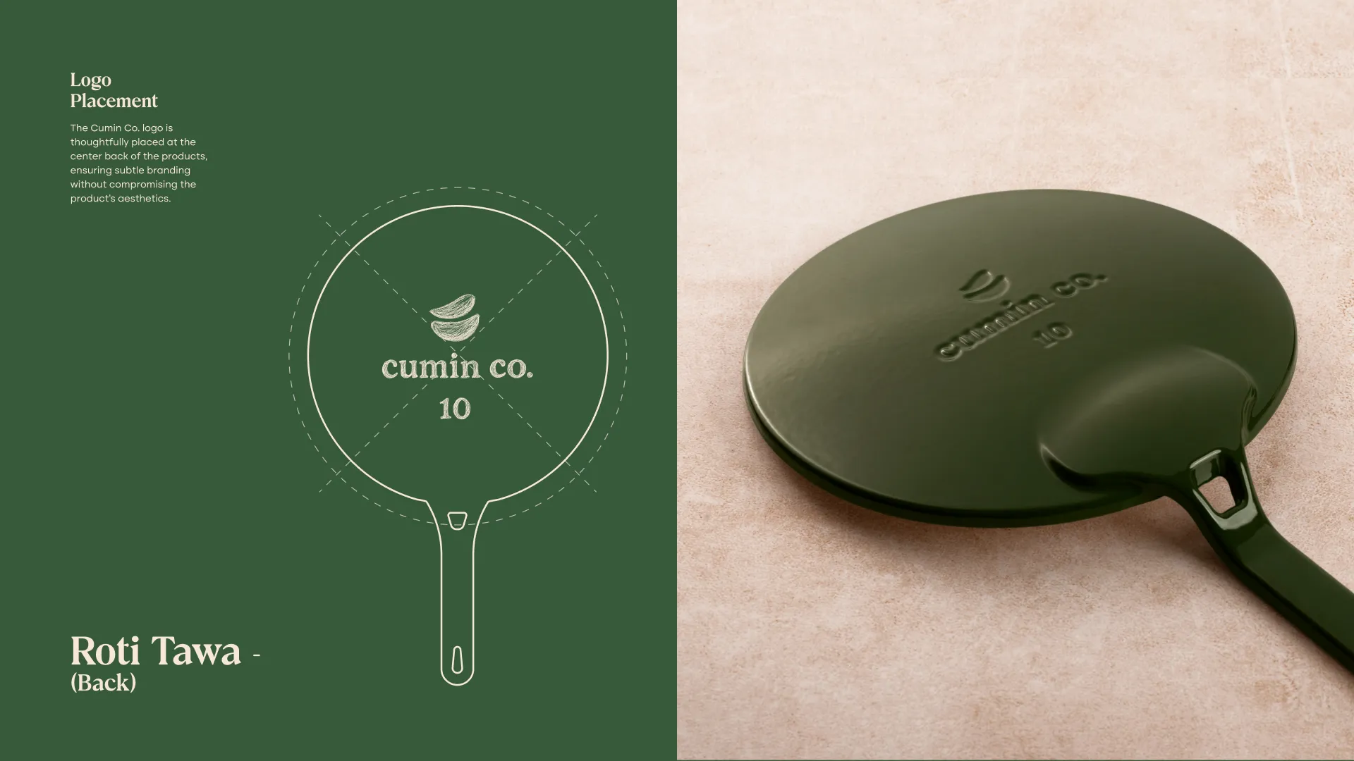
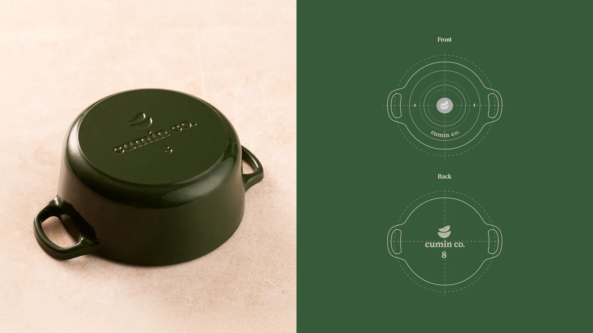
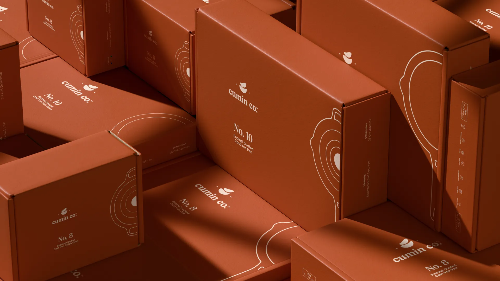
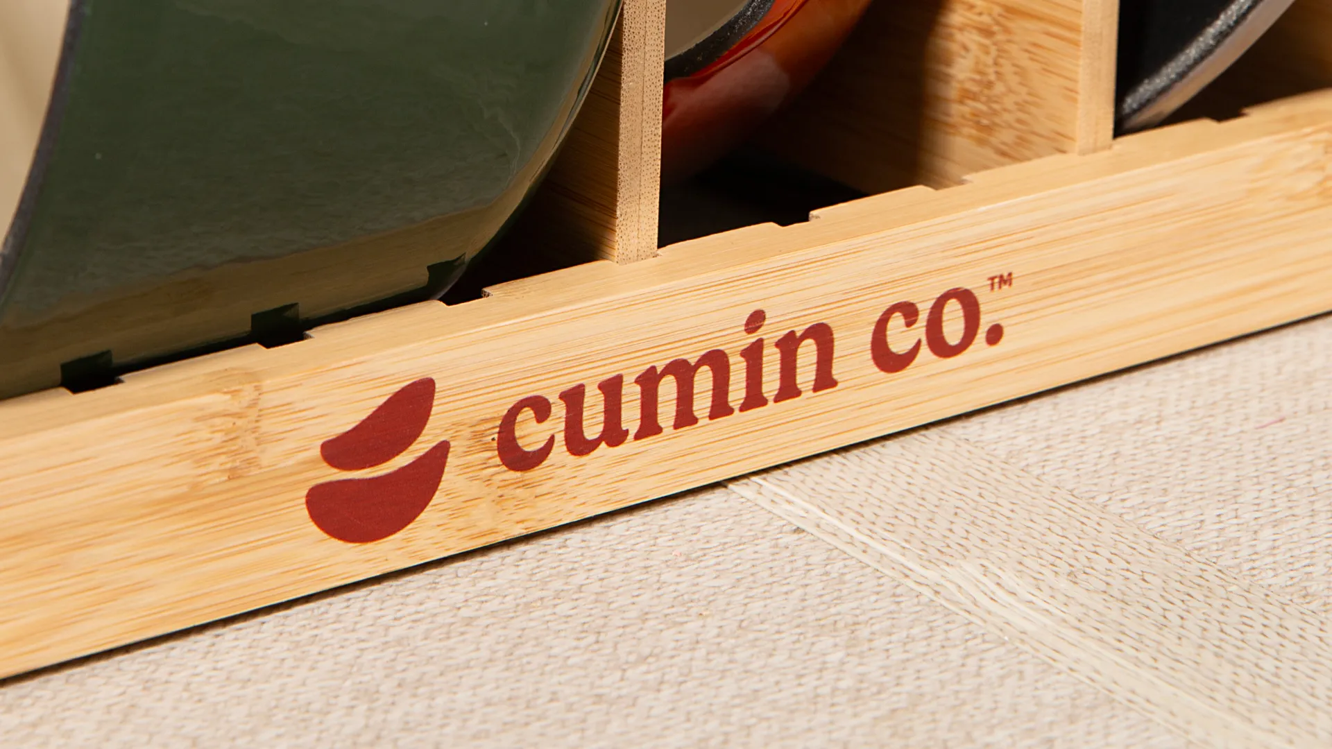
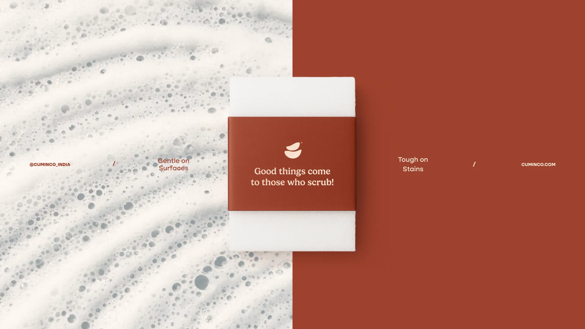
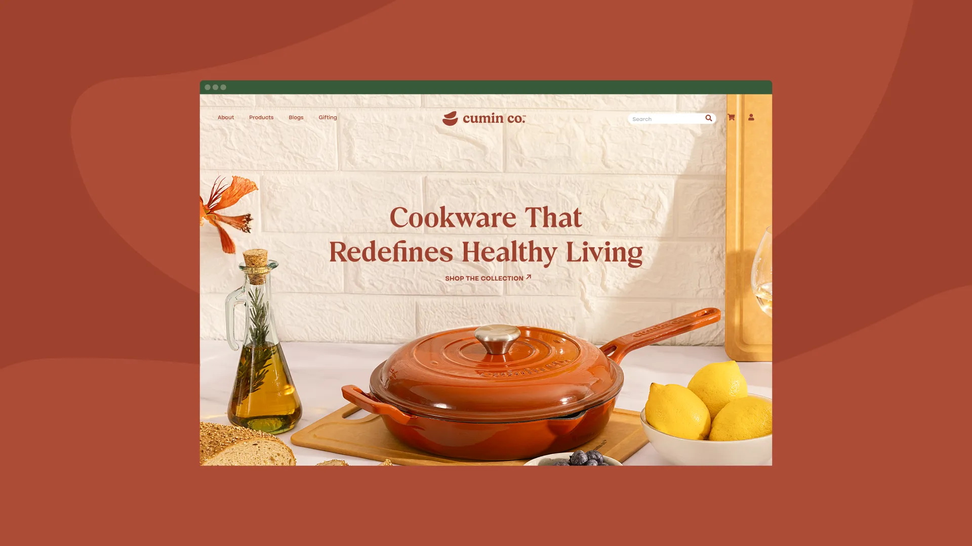
The design takes cues from the tactile charm of handmade pottery. The logo two curved forms reminiscent of stacked pots and cumin seeds symbolizes balance and warmth. A palette of terracotta, cream, and clay tones evokes the earthy heart of the kitchen. Paired with simple typography and gentle spacing, the identity feels timeless and authentic a reflection of food made with heart.


Creative Director: Yashita Aggarwal
Brand Designer: Studio Six F
Studio: Studio Six F
Our Work