


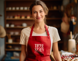


✨ From Shark Tank to a Magical Island @shop.aoba ✨
When Anushka and Aayushi, founders of the swimwear brand Erotissch, came to us after Shark Tank, it was clear the brand needed a fresh identity.
That’s how @shop.aoba AOBA was born—a brand inspired by a magical island, symbolizing transformation and adventure. 🌊
Together, we created:
🔹 A playful logo with a mermaid tail on the ‘b’
🔹 A vibrant tropical color palette
🔹 Modern typography with a refined touch
🔹 Stunning visuals and unique customer elements like postcards and boarding passes
It was incredible bringing this vision to life. Check out the full case study to see how it all came together! 💫
#BrandingJourney #SharkTankIndia #AOBA #SwimwearRebrand

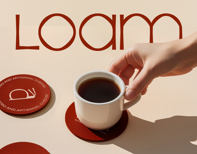
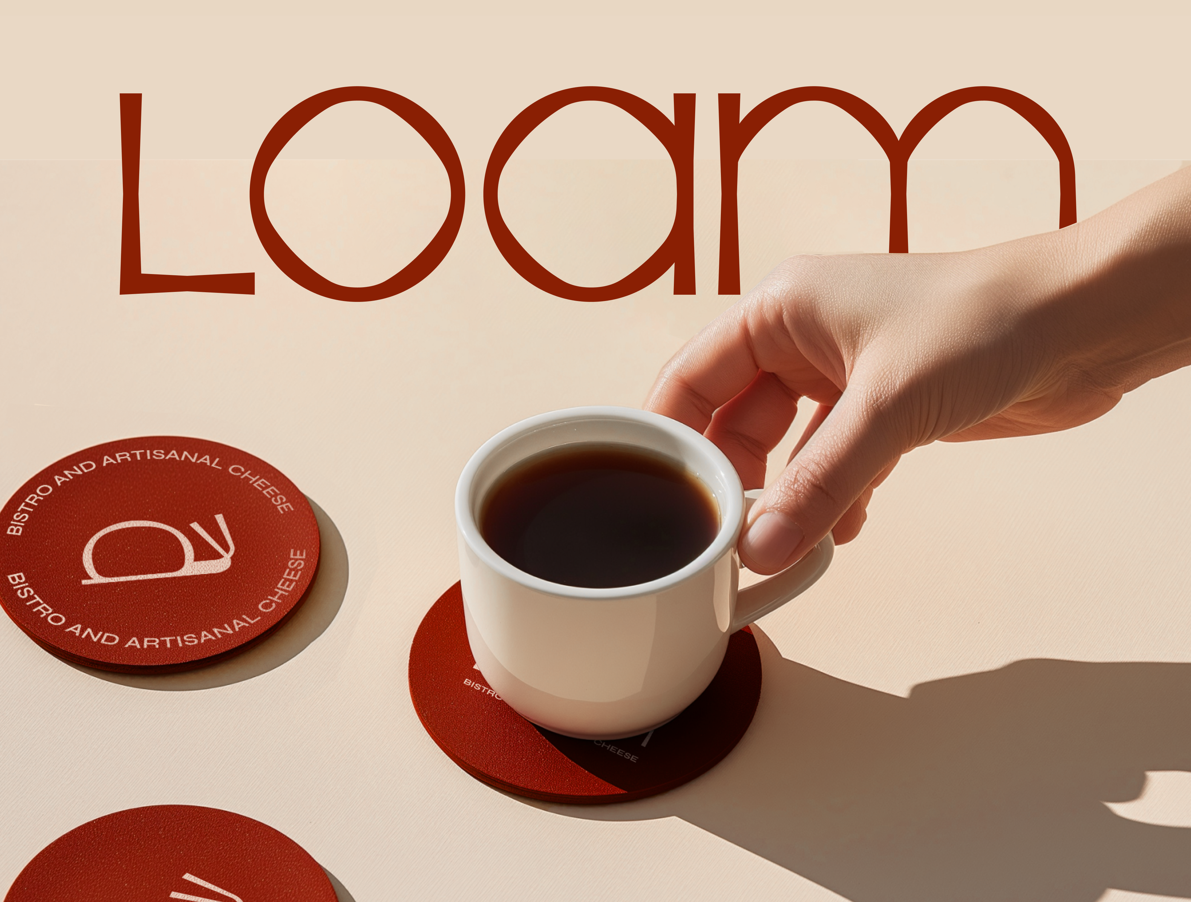
@loam.india , a bistro and artisanal cheese café based in Pune, is dedicated to the art of cheesemaking and the philosophy that “all good things take time.” The inspiration behind Loam’s brand identity came from the founders’ journey as artisanal cheesemakers. The name “Loam” symbolizes fertile soil, highlighting the connection of all food and life to Earth. Artisanal cheese, deeply connected to its local terroir—the soil, cattle, weather, and farmers—embodies this philosophy.
To reflect this, we conceptualized the humble snail as the main logo mark for Loam. The snail, sharing a symbiotic relationship with soil, promotes the idea of slow living, reminding us to take things easy and appreciate the process. This concept aligns perfectly with the ethos of artisanal cheesemaking.
The brand identity features a sophisticated color palette of burnt red, browns, and beige, creating a classy and minimal aesthetic. We also developed a dynamic iconography system, which includes various icons representing different elements of the bistro, such as coffee, drinks, breads, fondue pot, and cheese wheels. These icons, with their clean and simple design, seamlessly integrate into the overall branding, enhancing the visual language and making it easily recognizable.
Our comprehensive branding solution for Loam, from the logo to the dynamic iconography, encapsulates the founders’ passion for handcrafted cheese and their commitment to quality, creating a cohesive identity that resonates with their philosophy and vision.
CREDITS
Creative Director: Yashita Aggarwal
Brand Designer: Ayush Naresh Kumar
Graphic Designers: Nubaer Hossain, Subhan Mughal
Studio: Studio Six F
#BrandIdentity #CafeBranding #RestaurantBranding #ArtisanalCheese #Branding #DesignStudio #FoodBranding
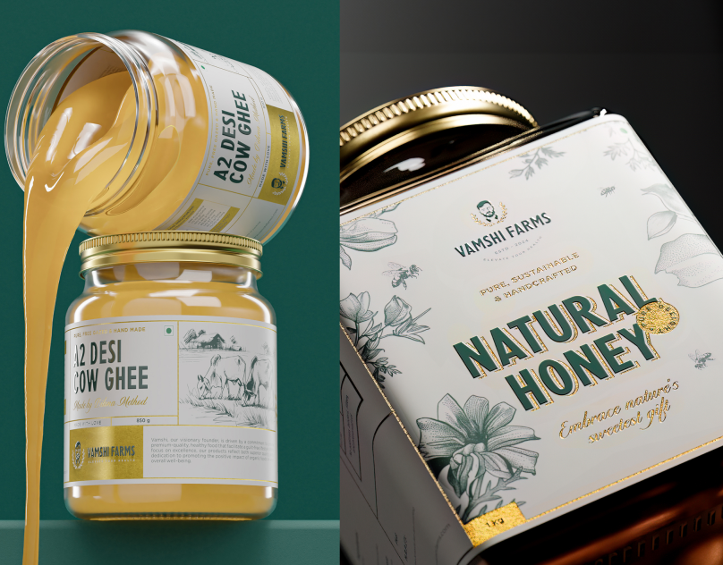
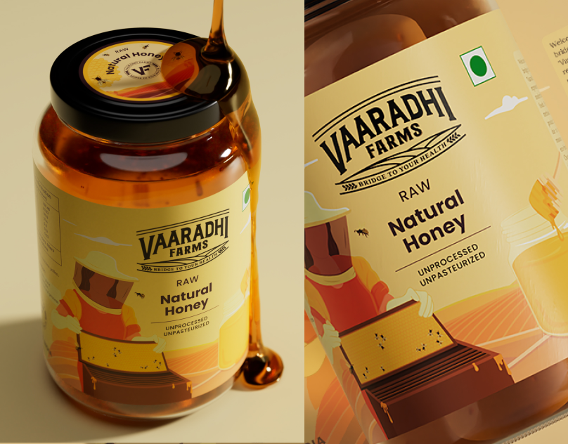
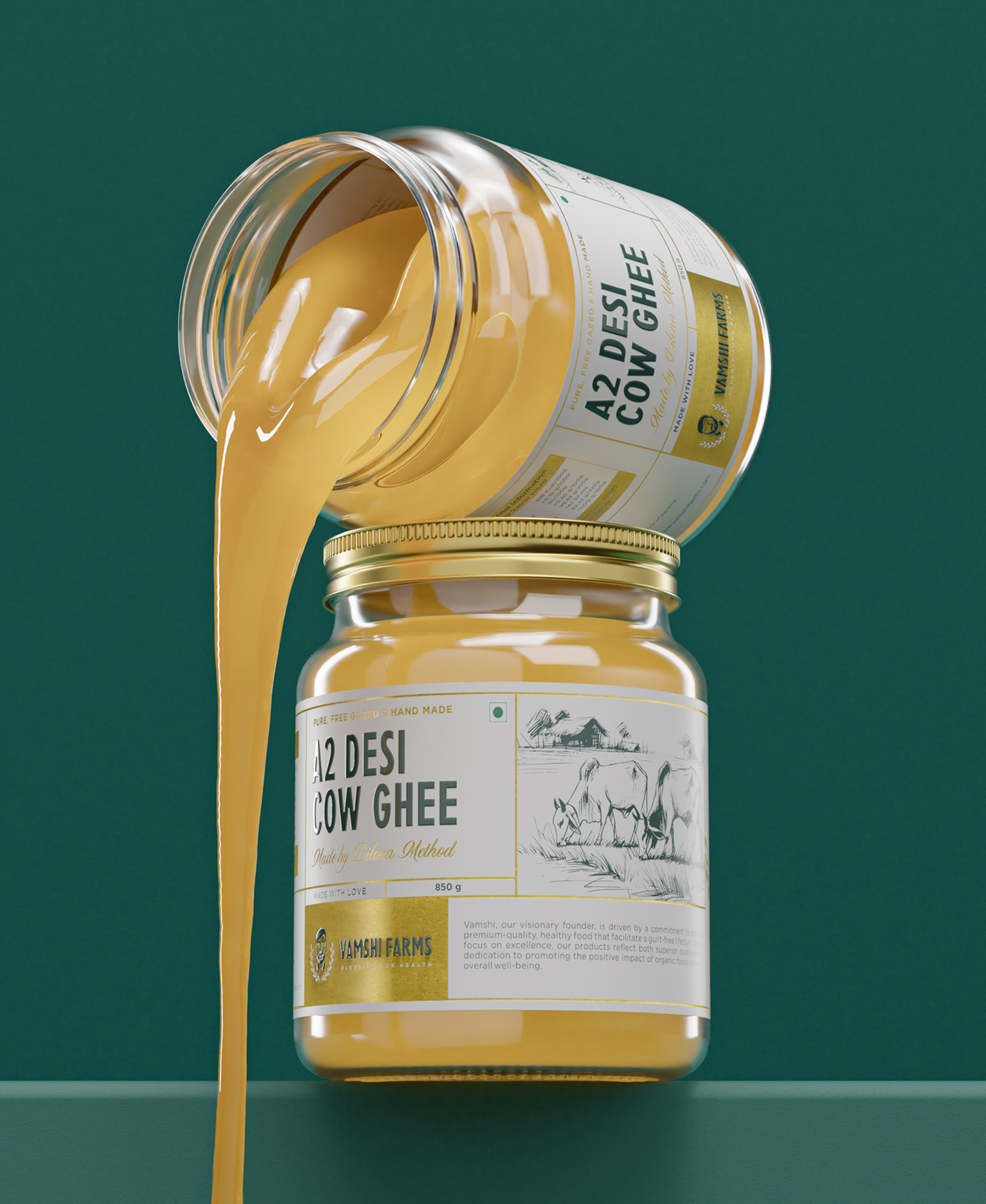
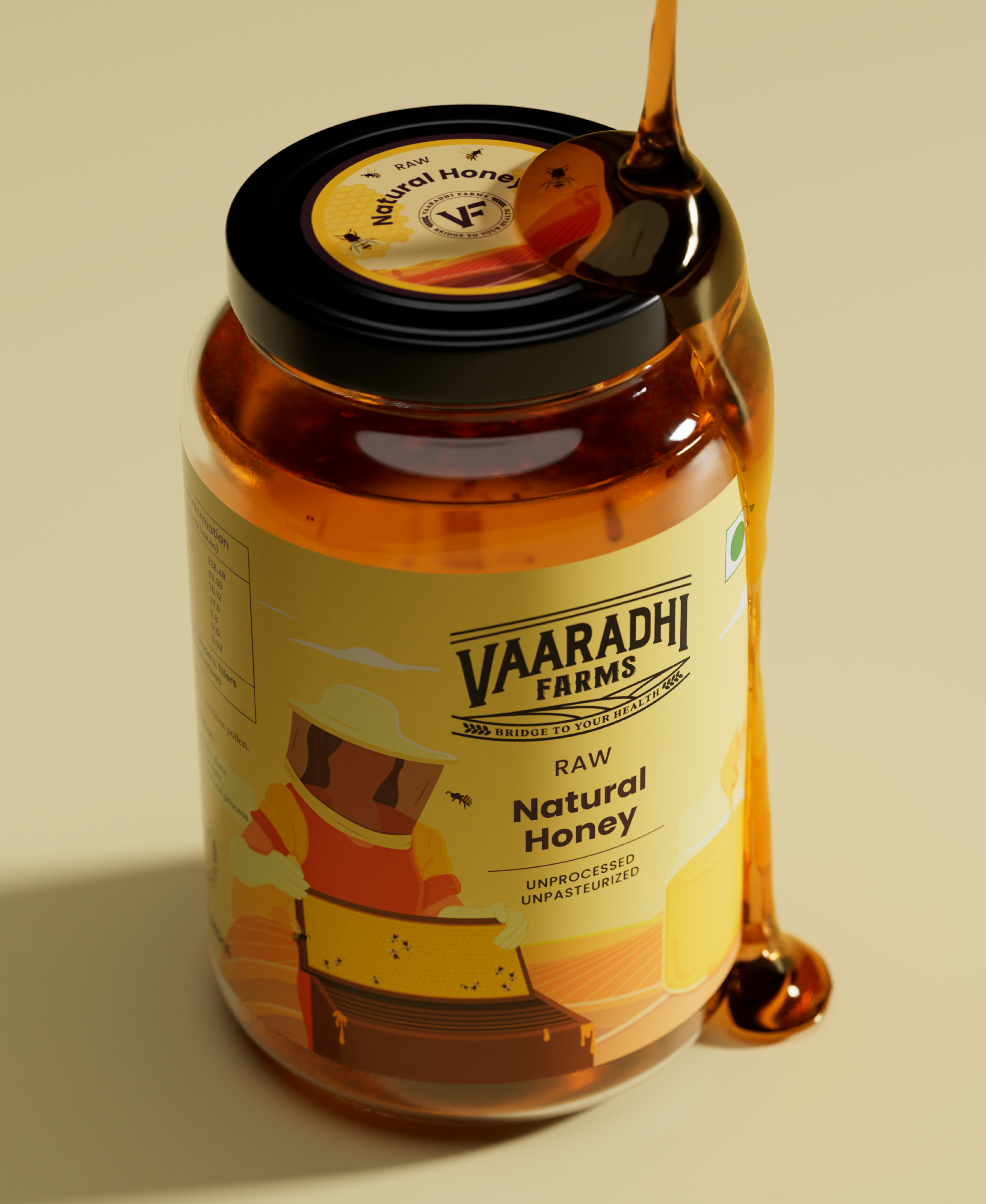
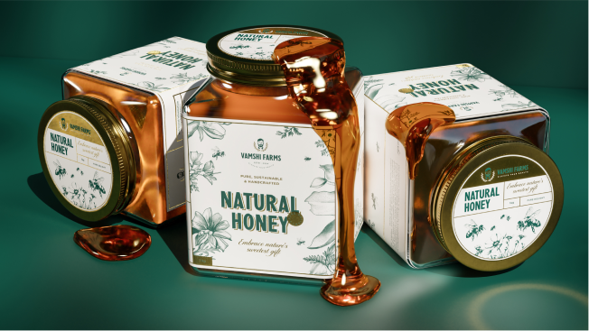
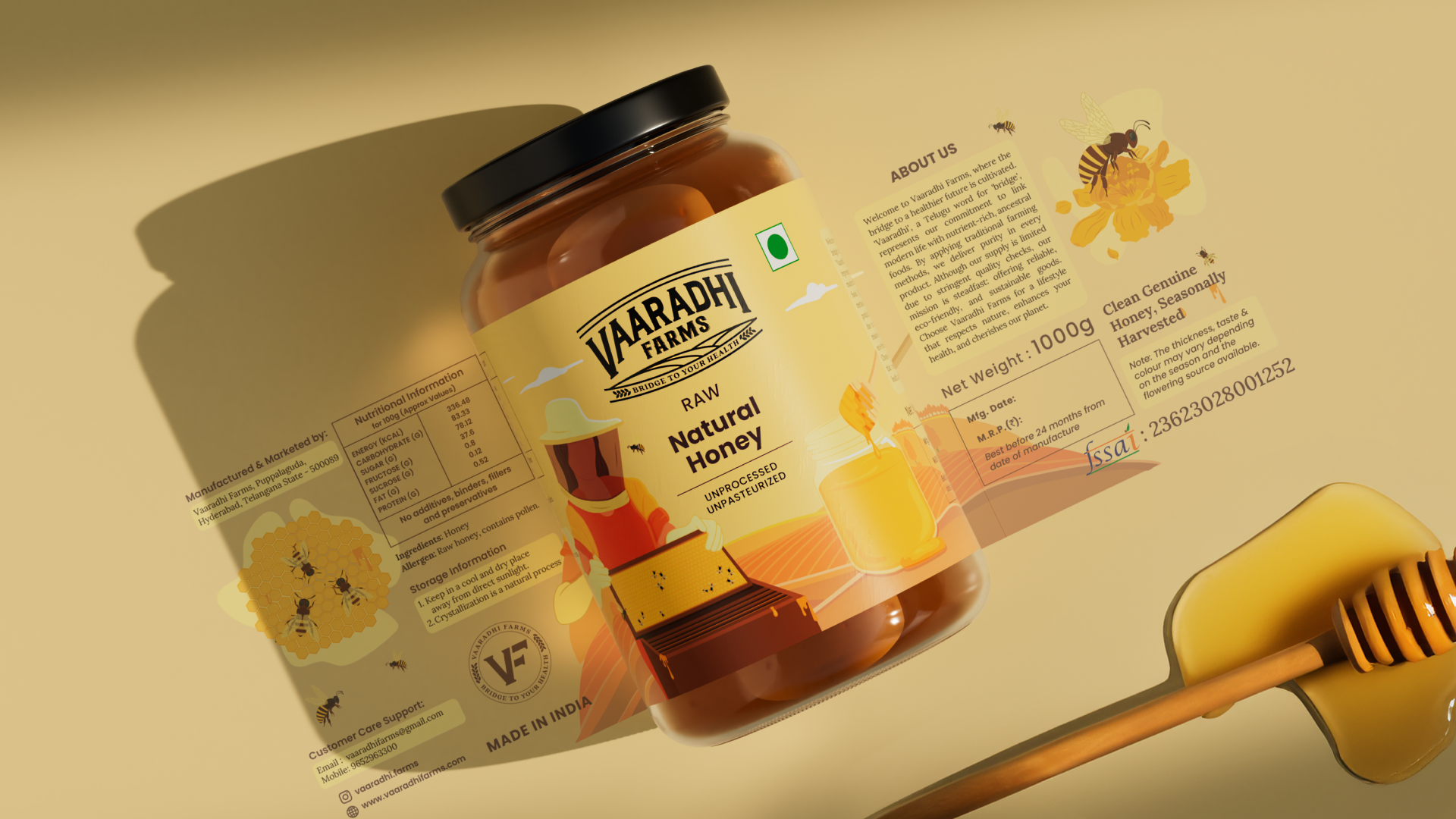
Case Study - Vamshi Farms
Vamshi Farms, a visionary organic food brand from India, is dedicated to producing premium-quality products using natural and traditional methods.
We’ve crafted a distinctive & premium brand identity and packaging design that captures the essence of organic farming for our founder led brand.
Featuring a portrait logo, earthy tones, and luxurious gold foiling, our design highlights cultural roots and premium quality.
CREDITS
Creative Director: Yashita Aggarwal
Designer: Subhan Mughal
3D Artist: Tanishq Kapoor
Illustrations: Midjourney AI
Studio: Studio Six F
#BrandIdentity #PackagingDesign #OrganicFood #Branding #designstudio #farmbranding
Vamshi Farms, a visionary organic food brand from India, is dedicated to producing premium-quality products using natural and traditional methods.
We’ve crafted a distinctive & premium brand identity and packaging design that captures the essence of organic farming for our founder led brand.
Featuring a portrait logo, earthy tones, and luxurious gold foiling, our design highlights cultural roots and premium quality.
Stay tuned to see how we elevated Vamshi Farms’ brand value and crafted their whole identity.
CREDITS
Creative Director: Yashita Aggarwal
Designer: Subhan Mughal
Animator: Nubaer Hossain
3D Artist: Tanishq Kapoor
Illustrations: Midjourney AI
Studio: Studio Six F
#BrandIdentity #PackagingDesign #OrganicFood #Branding #designstudio #farmbranding
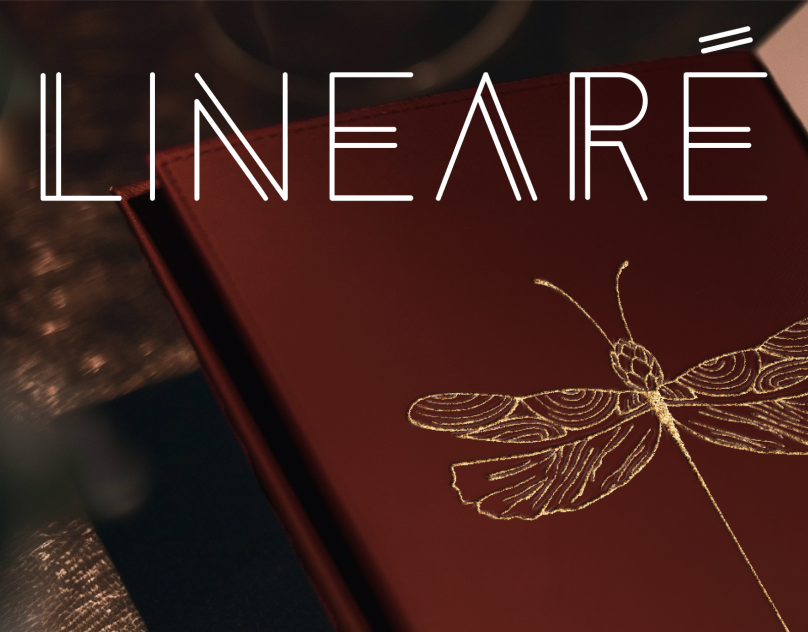
Linearé is an innovative gastronomy consultancy founded by chef Meha Kumar with Michelin star kitchen experience. It aims to elevate the dining experience by offering top-notch consultation for restaurants and startups.
The name Linearé signifies alignment, reflecting a structured approach and a focus on quality over quantity. Linearé combines a solid base in world cuisines with avant-garde flair, offering bespoke menus and comprehensive solutions for F&B operations.
The founder’s vision includes establishing a kitchen lab for R&D, conducting certified courses, and launching pop-up dining experiences. Linearé is dedicated to creating a culture that values fine food and culinary artistry, symbolizing sophistication and precision.
We had the incredible opportunity to design the brand identity for Lineare, a visionary culinary brand created by the talented Meha Kumar. With her 8-year Michelin star background from Spain, Meha brings unmatched culinary expertise to Lineare, offering gastronomy consulting, exclusive chef tables, and innovative culinary partnerships.
Our design journey focused on reflecting Lineare’s mission to redefine India’s culinary landscape with sophistication and structure. From the logo to the packaging, every element was crafted to echo the elegance of culinary arts, ensuring the brand’s identity is as refined as Meha’s culinary creations.
Swipe to see how we transformed Lineare’s vision into a visual masterpiece.
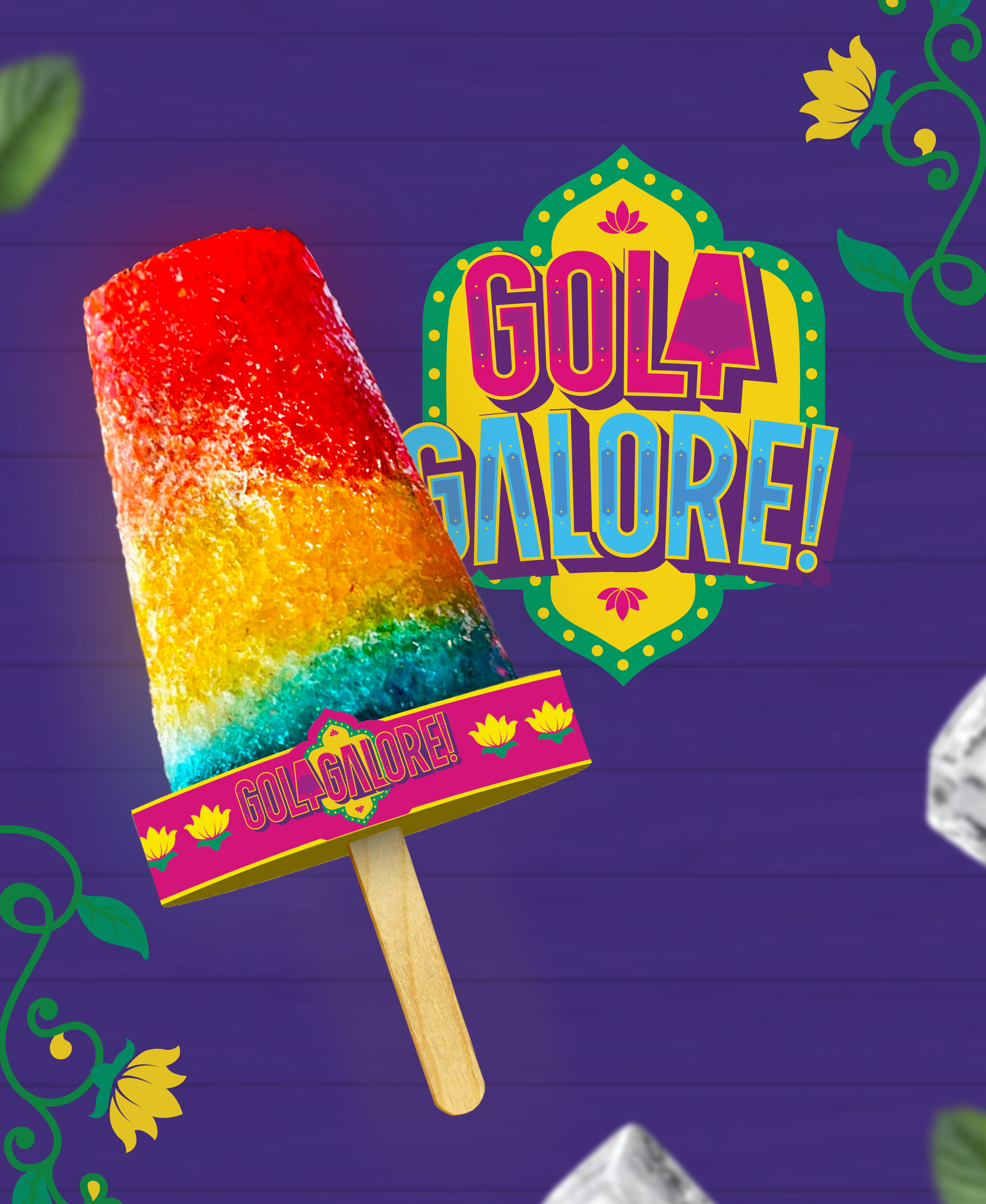
Gola and chuski gives me that childhood nostalgia! And hits right in the heart. It reminds me of those hot summer days when we used to step out to eat gola as soon as we heard the gola wala bhaiya!
So you can imagine my excitement when @golagalore approached us with the idea of starting a Gola brand in MALAYSIA! So we infused the flavour of 🌈 Indian truck art into the identity! We explored the Rajasthanim motifs and vibrant colours. Explore the complete project and let us know what you think! 🥰💯✨
@studio.sixf x @design.rohan_
#BrandIdentity #DesignStory #GolaGalore #VibrantBranding #IndianInspiration #Indianbranding #indiantruckart